Posts in Decorate
Before & after: roadside dresser
dresser before and after 4.jpg

For anyone who has read my blog for years (thank you!), follows me on social media (yay!) or knows me in real life (hi!), you'll know I love a good roadside find. In our part of the world, the local council allows each household six council clean-up piles every year, which means every week anyone who's had a big declutter piles all their discarded goodies onto the roadside just waiting for me to come and save them before the big bad rubbish truck comes early Tuesday morning. I'll show you some of my fab finds in a later post, but for now, here is my latest junk transformation. 

dresser before and after 5.jpg

I drove past this guy one afternoon with a carload of kids. I gave it a quick check over: no damage, nice and solid, great shape, loads of potential. It had a large mirror attached to the top by two large rods but they were simply screwed into the back of the dresser so were easily removed. I just needed the right screwdriver. So a few car trips, few less kids, few extra tools and a whole lot of magic car packing later and it was safely home ready for a little love. Before it got that transformative love, though, it got a whole lot of kids-playing-schools love. In the middle of the living room!

dresser before and after 1.jpg

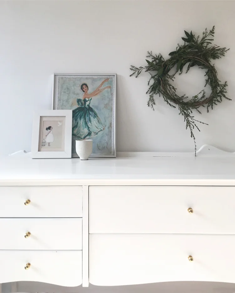
Layla had claimed it as her own as soon as we saw it, so I asked her what colour she wanted it as we were about to finish renovating her room and actually decorate it. White. I don't know, but I think she could be my child! So I sanded it back, primed it and gave it around three thick coats of SolarGuard in semi-gloss (TIP: I always use outdoor semi-gloss on my indoor trim and furniture. If it can handle the weather outdoors, it can surely handle my kids inside!) I finished it off with some tiny gold handles from Bunnings for $2.60 each - they're like little earrings and I think they're perfectly dainty and feminine for the pretty shape of the piece.

dresser before and after 3.jpg

We moved it into Layla's room where it acts as a dresser for her bits and bobs but also a desk when she wants to draw and I kick her out of the kitchen. It happens. We're still to add a shelf and cork board/pictures above it, but for now it's home to a picture my mum painted when she was about 12. We made the wreath at our friend's Harvest Market a few months back. It's still in that same spot, albeit a little less green and healthy-looking! 

Beautifying and highlighting imperfections in the home
gold leaf kintsugi 1.jpg

If you've read my waffle for the past 9 and a half years (seriously, that is how long I've been blogging. That is scary.) you'll know how I'm not big on perfection. Perfect spaces, perfect people, perfect things - they are not real to me. Add a little wonkiness to a house, some mess to the waves of someone's hair or a few tell-tale signs of age on items and they become more interesting to me. And usually more beautiful. Recently I read about Kintsugi - a Japanese art form that sees damaged items repaired with gold (or silver). Rather than throw away broken crockery or smooth over cracks in rendered walls, the imperfections are highlighted with gold leaf and sealed with lacquer, creating an interesting feature of a home or allowing a favourite plate to continue dishing out your meals - with a little bling on the side. The method humanises things - giving them some attention, patching them up and letting them continue on their merry way rather than just giving up on them at the first sign of a breakdown. It's giving even the most ho-hum items a history, a story and a chance to shine. It's such a sweet sentiment in this throwaway world, and because I love gold leaf - and maybe because Marie Kondo and her whole "socks have feelings too" craziness has rubbed off on me more than I thought - I had to try it out on some damaged things I had around the house. 

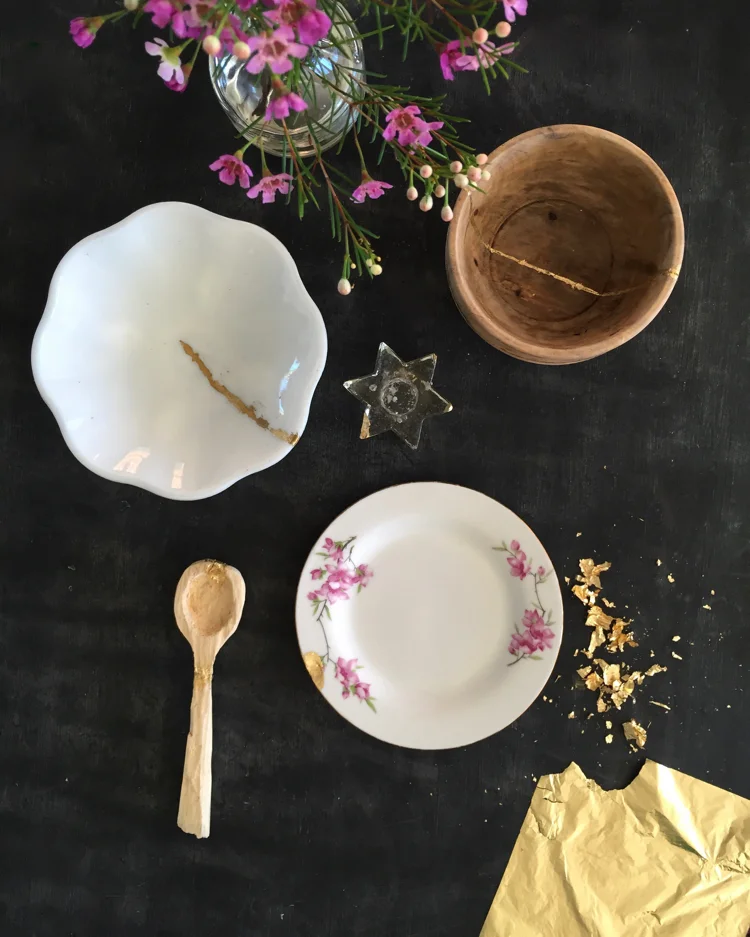
First up: the small wooden bowl Steve found in the water on one of our walks a few years ago. It was green and gooey on one side and stunk like goodness knows what, but we thought it might clean up ok. So we soaked it and scrubbed it and it did clean up beautifully - but it was cracked in several places. So in went the size, and in went the gold leaf. It's certainly not the neatest follow-the-line I've ever done, but that's the whole point about this method: imperfections can be beautiful, and the wonkiness just gives it even more character. I love the glimmer on the rustic wood - I could never tire of that combo! 

Next, I hit up the kitchen cabinet where my Nana's dishes were. The pink floral plate was part of a few sets my grandparents bought many decades ago for my mum's wedding. I had a full set once - complete with tea cups and saucers - and accidentally threw the wrong box on the charity pile (and managed to keep a whole bunch of unwanted crap on the keep pile instead! Eek!) so I only have a few pieces left. I knew there was a big chip out of one of the side plates, so a few minutes later that chip looked a whole lot chipper (sorry) with its new gold coat - especially since the plate is gold-rimmed. I also blinged up a few op-shop pieces - several chips in a little star candlestick and the tiniest crack in a milk-glass bowl.

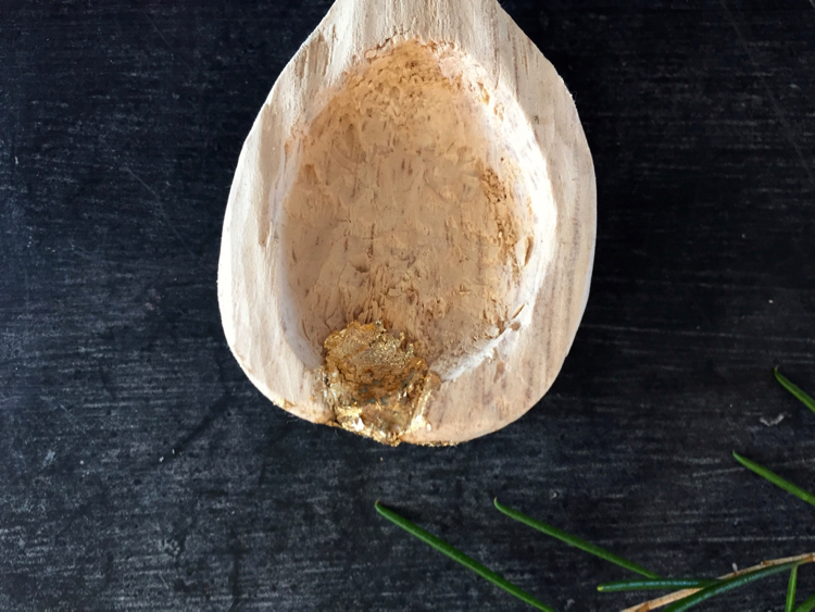
I actually thought that was all I had when a few nights later I decided to try my hand at making a wooden spoon out of a piece of driftwood and a lino-carving tool. Obviously, neither of these things are going to work as well as, say, proper wood and a real wood-carving knife. But I wanted to see what it was like to do before I invested in a proper knife and so had a play. It was strangely addictive - I drew a shape, cut and carved with the rounded lino tool (and yes, cut myself several times) and in an hour or so had a pretty cool shaped spoon. Except a knot was right where the rounded end of the spoon was and soon became a hole! And then, while wondering when I should quit it on the handle -  SNAP! I wondered too long so the whole thing broke. I originally threw it on the compost, but decided to keep my very first attempt at spoon carving because I really enjoyed doing it - even if it was never going to be able to be used as a spoon, was not even close to smooth and had a hole in a crucial part of it. Steve glued it together for me and I gave it the gold treatment. Now, rather than just being a weird unfinished, holey, broken wooden spoon, it's got a story, a history and a little bit of prettiness about it. I love that!

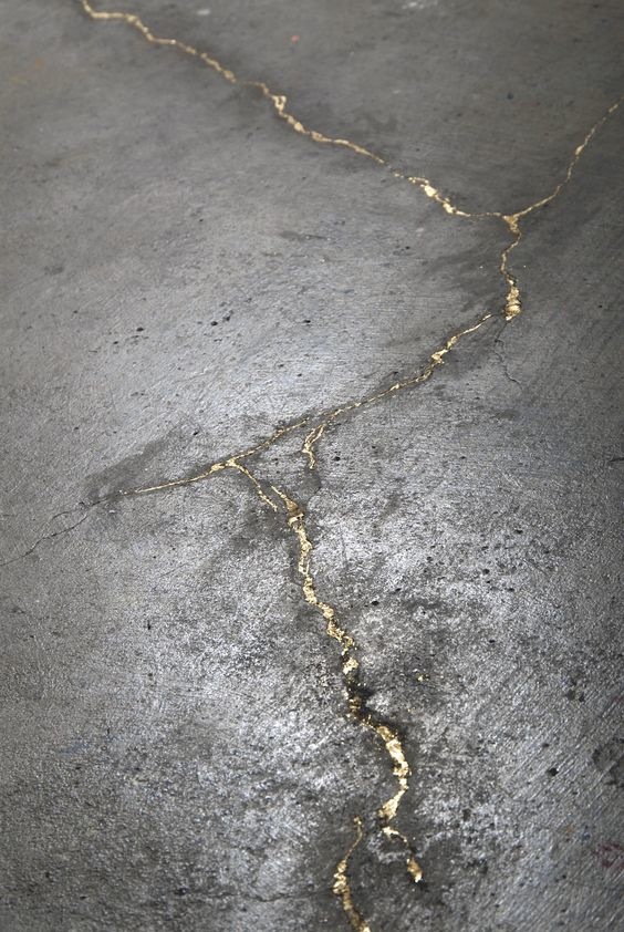
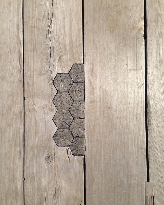
It's kind of an addictive idea - I can't help look around the house and see other imperfections I'd love to highlight somehow: holes in the floorboards from old knots, cracks in the concrete driveway... I'm completely in love with both of these ideas, above, from the

original article

I read about kintsugi. The art form is not just about gold leaf, but also patching things with similar materials but in different shapes, colours or patterns - such as adding the odd patterned tile in a bathroom wall of solid colour tiles. It really is giving the less-than-perfect aspects of a home some time in the spotlight to shine. And who doesn't like that occasionally?

{Top 3 images by Belinda Graham for The Happy Home. Concrete and gold leaf image is an part of an installation called Seam by Catherine Bertolt via

Workplace Gallery

; Patchwork timber floorboard via

Material Valley

}

My home style over the years
black bedroom.jpg

After

last week's post

about Instagram messing with my mind and making me question my taste in things, I wondered how much my style had changed over the years. So I went through the archives of my blog (and when I say archives, I mean the archives via

Wayback Machine

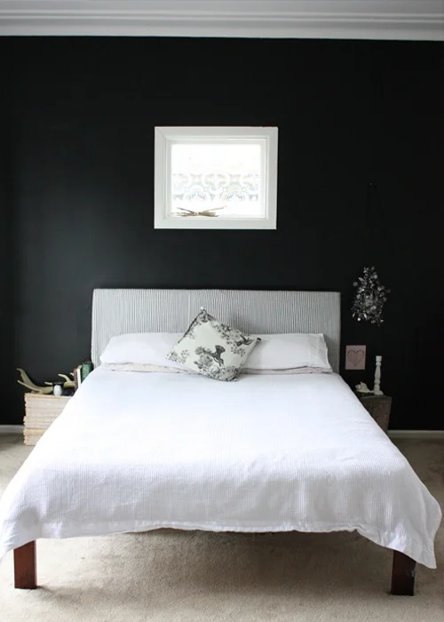
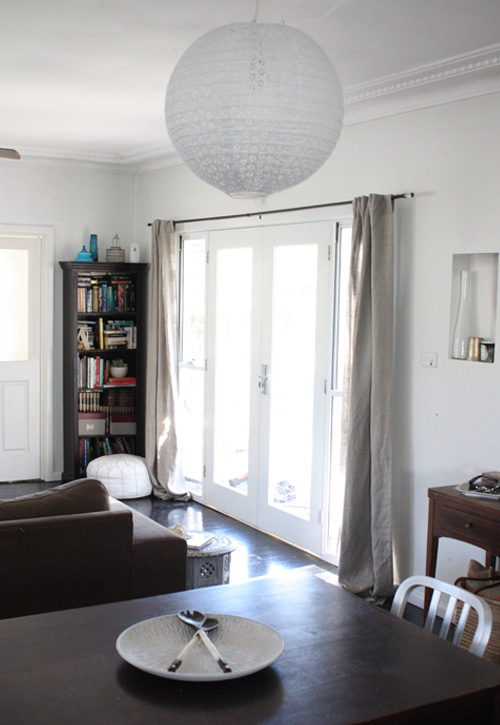
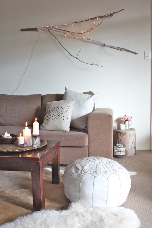
- this poor blog has been majorly hacked a couple of times over the years, meaning a whole bunch of content has yet to be posted to this site; I could win awards in procrastinating). Anyway. Going through the archives I realised my style hasn't changed too much at all - maybe refined a little, but mostly, the basis is the same: white, black, grey, hits of natural timber and a shot of surprise. For colours I still like them muted and with a touch of grey.

I also spent a silly amount of time looking through my Pinterest boards - back to the start when I first starting pinning images I loved. Aside from the odd WTF picture (usually after looking at it for a little while wondering if it was an accident, I noticed there was some small part of the image that spoke to me, not the entire thing), I realised again, it was pretty consistent. Looking through my past, it's clear I've always had these relatively clean, simple spaces. Even when the mess was insane covering every surface and you're ankle-deep in tiny toy cars or dolls, the spaces were still relatively simple in terms of furniture, decor and colour. I've always said I was afraid of colour and would joke that I'm boring in my decor. I wondered when the urge to throw a red cushion on my couch would hit. Or to buy bright art or paint a wall something other than black, white or grey. It never has! So boring or not, this is obviously who I am and I guess there is nothing wrong with it. It's taken me a while to accept that. I thought I was waiting to grow up and find my style. It turns out it's the same style I've always had and most likely always will. I realised, though, while the rooms are pretty simple and standard, I've always tried to incorporate some kind of statement feature - murals in a kids room, driftwood hanger, cut-out recessed shelves, stencilled window, black wall, fairy lights in a branch... Just one thing to make it look a little more unique - and it's not often something bought, but something made - something just for you that not every single person on Instagram has bought from Typo or Kmart or the wall decal store. Creating something yourself - or directing someone else to do it for you! - is the best way to inject that bit of personality into your home. After all, a house is a home when it reflects those who live there. 

I can't imagine me straying too far from this formula for our upcoming extension and renovation - in my mind the house itself is all blindingly white walls with black accents on door hardware, the fireplace and fans, stair rails and balcony and the odd piece of furniture. The floors will be natural timber (my whitewashed floors were nice, but annoying to upkeep so they're going), there'll be a few statement pieces of furniture (hopefully!), a bunch of greenery with houseplants, simple and stylish rugs, a few fun kids elements and pieces and features that we love and that bring us joy (see

previous post!

). 

It's all going to be simple and clean - the calming backdrop for our chaotic lives, the perfect blank canvas for our colourful crafts and imaginative play, the ideal space for our family to grow, spend time with each other and have our own spaces for that all-important alone time. The kids will get a say in how their rooms will look and Steve will have his own library space to play with, leaving me in charge of tying it all together. I can't wait. 

{All images of my previous homes. Pictures by Belinda Graham for The Happy Home}

imogen's nursery corner
immynursery18.jpg
immyprint

This print was a gift from sweet Amanda of 

Calico & Co

 and 

Lemon Tree Lane

. I couldn’t see it as an option in her store, but it should be! I’m sure she’ll be happy to chat to you if you want one too (she’s nice like that).

Imogen actually slept today so I was able to tidy up her “room” and take some pictures. Of course, it also meant she slept TOO much and I had to take the snaps with her in the bed before I lost the light… Typical! Her room is actually a teeny portion of my bedroom – it’s one half of a wall. I like my babies to sleep nearby for the first six months or so and in a little cradle – they look so ridiculously lost in a proper cot!!

moodboard2

This was my original 

moodboard

 for her nursery when she was Bubble. We didn’t know her sex and even though I wasn’t planning to decorate a full nursery, I of course did a moodboard. It’s not exactly what I’d planned, but in my world, that would be rare anyway!

bubbleroom5

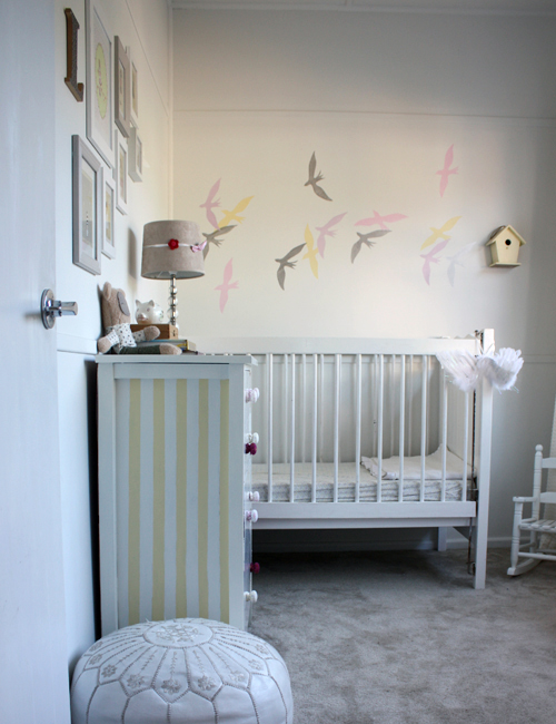
So, I started with the room looking like this (above) – 

grey and white

. I still love it looking all minimal and simple, but then I went and had a little girl and there is NO ESCAPING THE PINK. So mainly due to the fact her clothes and gifts were pink, it became pink and grey with a little peach dotted throughout in the clothes and sling on the side of the cradle. And so… here it is (I may have gone overboard with the number of images. Sorry)

immynursery9

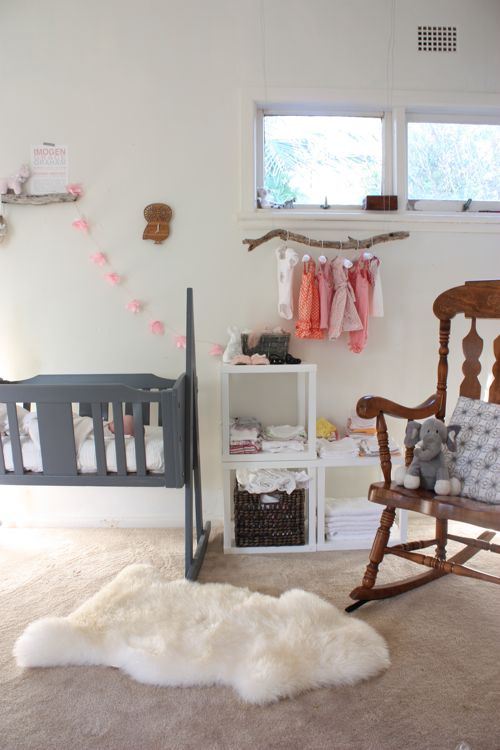
This is the “nursery” in its entirety. Not much to it, is there?! I like all the colours together and the hits of nature.

immynursery18

I painted the cradle a deep grey. It’s my own custom mix – chalkboard paint mixed with white undercoat! I love the matte chalky finish and went crazy with the same colour throughout the house – Layla’s bedhead, the step stool, a chair…

immyroom1

I used another piece of driftwood as a mini shelf – it’s stuck on the wall with a million 3M tapes (and the cradle is out from the wall so no chance of anything falling on Miss Imogen even if it does fall). The little horse is by Kate Finn and the teeny tiny ballet shoes were Layla’s – they’re from 

Chateau de Sable

.

immynursery11

I love this little clock (hmm, still need to set it!). It’s 

Decoylab

 and I struggled choosing which style I wanted, but the owl won. From 

Hunt & Gather

. BUT, I just noticed the Decoylab website is having a giveaway of THIS VERY CLOCK! Chances of that?! You’ve got till April 30 to enter – 

click here

. The tissue paper garland is made by me – I’ll have a tutorial for you tomorrow.

immynursery8

The white cube shelves are from Kmart. They cost a while $19 each. The sheepskin rug is Ludde from Ikea.

immynursery2

Love this reversible sling, only none of my children actually liked being in it. Sigh. So it’s always been a room decoration until they’re old enough for the hip-slinger style. It’s by 

Rockin’ Baby

. The giraffe is S

ophie The Giraffe

 teether.

immynursery5

I’ve used my mum’s rocking chair for all three kids. It’s fun to rock with them and I would feed in it at night but I’m way too lazy and prefer to slouch or lie in my bed.

immynursery6

I bought this little elephant while pregnant with Zak. Coles – of all places – had a bunch of really cute stuffed animals so I bought a few of them. Ooh-Ahh (Zak’s monkey) and Lion (Layla’s lion – original name) are their best mates and they nominated Elephant for Immy. I’ve since banned stuffed toys as gifts because I despise them en masse, but I’m still happy with this original buy – every child needs one fave cuddly bedtime pal… The cushion is actually a tea towel – another sweet gift from Julie of from 

Olive & Joy

. But I love the pattern and colour too much to ruin it as I do all my tea towels, so I turned it into a cushion. Keep an eye on the store as you’ll soon be able to buy a cushion in this print.

immynursery16

My driftwood hanger – wow, the last image of this (the grey and white one, above) got around the WWW, which was nice. I do love this.

immynursery13

Immy’s little shoes (the slippers are 

Britt Design

)

immynursery14

Mr Rabbit is from Typo (man, I love that store!) and the little paper boat I made – originally I was going to do a string of little multi-coloured paper boats to hang on the wall, but then I had a little girl, so the boats went to Zak and Layla to sail in the puddles and I just kept the one.

immyclothes

Teeny tiny clothes, a basket of wraps and a stack of spew catchers (ok, they’re nappies, but Immy is such a spewer, that’s what I call them) make up the rest of the cubes. And no, they’re NEVER this neat.

So there we have it – Immy’s little nursery corner/wall. Thoughts? One of the comments in my survey was a suggestion to have a before and after of the styling of a space. I thought it was a great idea. So tomorrow – provided I get the time! – I’ll show you how I put the room together, how it looked before I made it photo-worthy and a few other sneaky things I did to get it to this stage. Because despite my slight rant in my previous post, I do edit and style when I take a picture of a space. Just not as much as magazines do!

immynursery3

Sleeping beauty…

{Images by Belinda Graham for The Happy Home}