Posts tagged shopping
freedom has me excited about autumn and winter...
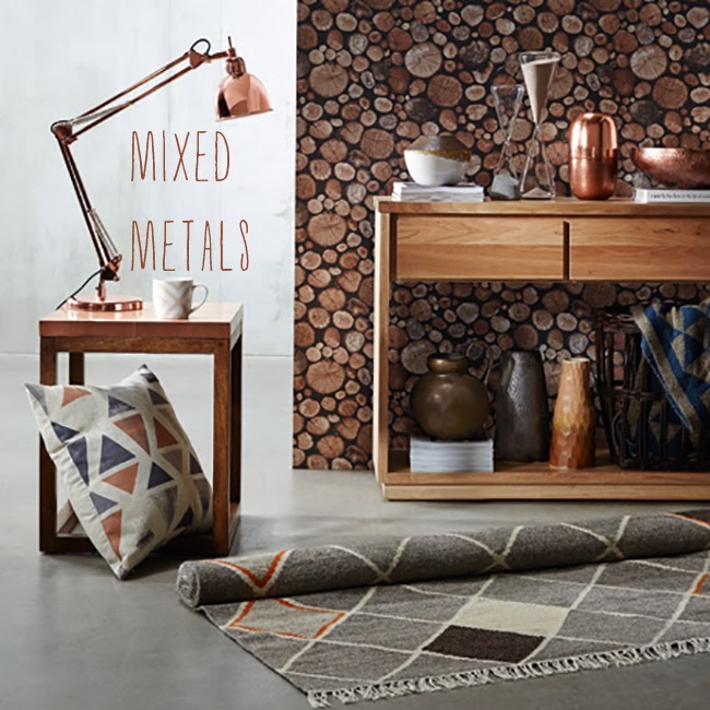
This is not an easy thing for me. I don't do winter well. And I don't even live in a cold area -  I would not survive a European winter (or a US polar vortexy one). But, walking into what I thought was a run-down dilapidated terrace house* in Woollhara on Tuesday for the Freedom launch had me thinking it just might not be so bad on those curl-up-on-the-couch-it's-so-cold days. I guess that's what makes a good homewares collection - the ability to see yourself in your space with THEIR things. And that's exactly what the new Autumn/Winter collection does for me - makes me want to buy everything and totally make my home a coppery, inky-blue and prettily-patterned space. Except, of course, that this all costs money. But if money were not a slight stumbling block? I'd totally do this using these fave new pieces from Freedom...
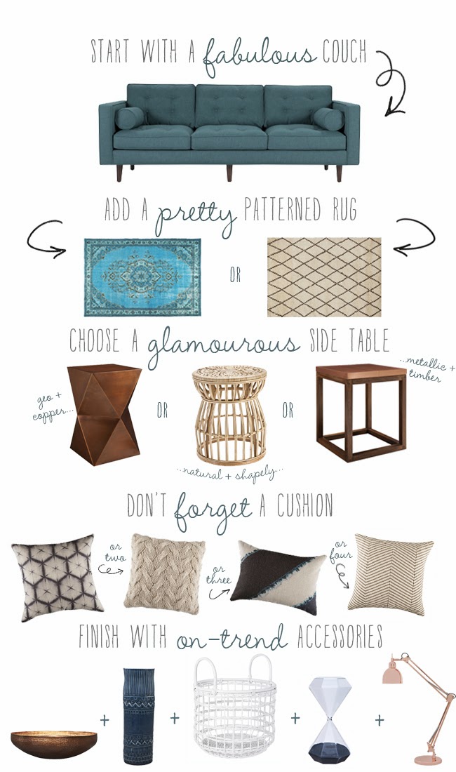
 

Couch: Copenhagen 3-seat sofa in Lido Teal, $1499
Rugs l-r: Rajasthan floor rug (limited edition), from $999; Moroccan Boxes rug, from $349
Side tables l-r: Mr Johnson side table in antique copper, $229 (introductory price - it will be $279 from March 15); Palisade side table in natural, $199;  The Professor Square side table in copper, $289 (introductory price - it will be $349 from March 15)
Cushions l-r: Tulia Allover cushion in ink, $34.95; Quest cushion in almond, $49.95; Tulia cushion in ink, $29.95; Avi cushion in natural, $34.95
Accessories l-r: Hathor Deco Bowl in metallic copper, $54.95; Acclimate Vessel in squid ink, $34.95; Fete 2 handle basket in white, from $49.95; Magnium Hourglass in charcoal, $29.95; Tre table lamp (limited edition, $179

But with tens of thousands of dollars poured into my renovation recently (oh and no, we're still not finished the kitchen - there are windows but no walls. Plasterer coming on Tuesday. Apparently.), I only have a small furniture and homewares budget so have to be careful. So no gorgeous teal couch for me. BUT on my definites list is the hourglass timer above (it reminds me of my diamond light bulb), a copper table lamp (my fave hasn't been shot yet, but it's the Metro Table Lamp and is $149) and at least two of the above cushions. I'd love a copper side table, but there is a rule I have for trends and that's not to buy them big or bulky or expensive - little doses is more me and I can always spraypaint a lamp (it wouldn't be the first time. Or third). 

Saying that, my absolute favourite pieces in the new Freedom collection were the trend ones - the gorgeous copper everything (there is a BED!), the limited edition overdyed rug and the shibori textiles. Next, the limited edition timeless heroes - a teal button-backed sofa, a leather butterfly chair, a spectacularly patterned round rug... But a quick way to add some warmth, colour, pattern and style to a space and make it cosier and Pinterest-worthy is the littler things - really beautifully patterned vessels and bowls, tall glass hourglasses, touch-me cushions and throws, a glam copper lamp with huge round Eddison bulb. And a new rug, below. These rugs are beautiful - neutral enough to last the test of time, but so on-trend now - two-birds people. And this is the last time I am mentioning the word trend... 


Small and not-forevers they may be (save the rugs), these pieces ARE worthy investments because they're little bits of happy that instantly update a space when you might not be able to spend over a grand on a couch. And double-duty items are the best kind - all of these are not limited to one room like, say, a bed! Cushions and throws work in the living room, on a bed, outside in the teepee for picnics, on a bench seat at the dining table - heck, on a cold metal chair at the dining table or desk; throws are for rugging up in on couch, for dressing up a bed or an occasional chair and for CREATING teepees in the backyard for picnics (just ask my kids - anything bigger than a face washer gets dragged outside for impromptu cubbies. Even in the rain.) Vases and bowls can be moved into any room for a fresh new vignette - as can lamps. See? And just like when you break down the cost of a piece of clothing by how many times you wear it, the same can be done for homewares! 

So to rave just a little more, I'm very impressed with Freedom's autumn/winter  - well done buyers! I did mention to them I've noticed a slight change in their most recent ranges - I believe they've upped their game significantly since West Elm and Pottery Barn opened up in Australia. In fact, I believe a fair few of Australia's homewares stores have gone out of their way to make their latest ranges fresh, current and more competitive. And good on them - many people would prefer to support local rather than global giants. 

To finish, here is a sneak peek at the launch through the lens of my very, very cracked iPhone and Instagram - where stylist Jason Grant put all the pretties together to come up with this... 


See anything you like?
PS: you can follow me on Instagram here or at @belindagraham

*The house was actually NOT dilapidated, but very cooly refurbished and decorated with the most amazing chandelier made from crystal decanters. It's called Bite Club House and is available to hire for events or can be booked for a very awesome dinner party. Check out the website and the before and after pics here.

Image credits: 1. Collage by Belinda Graham for The Happy Home; 2. and 3. courtesy Freedom; 4. collage by Belinda Graham for The Happy Home using Instagram and phone images.
the kitchen renovation: moodboard
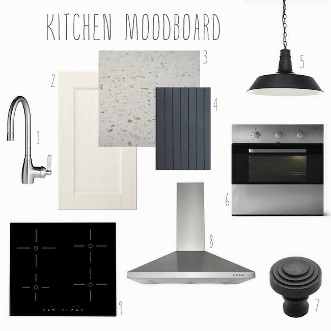
When we first looked at buying houses, I knew exactly how I wanted my kitchen to look - charcoal cabinets, grey or white/grey marble-style counters, open shelving instead of wall cabinets, white subway tile... And then I started to actually plan the kitchen properly for this space and changed my mind about pretty much all of that, save the subway tile which will probably still get a run. I did know I didn't want all white. I LOVE white, but I needed some kind of contrast, some texture, some natural elements. It was always going to be an Ikea kitchen - I was happy with the one we installed in our last house, so planned to do it again, with better doors and a few features that might make it look less "Ikea kitchen" if possible. Not that there is anything wrong with that! I just like to add my own touches. Funnily enough, I ended up buying more from Ikea than last time (this time I bought the appliances as well!), but we went to a local supplier for the stone benchtop (which was installed yesterday!) and online for the lights and knobs. So here are the nuts and bolts of the space in picture moodboard form, and below, some of the ways I'd like to introduce some wood to warm it up.

1. Elverdam mixer tap, Ikea I don't quite get the point of the pull-out taps. I know those who have them couldn't live without them, but like gas, I've never had it so don't know what I'm missing! So I chose the one that didn't pull out! I love the gooseneck shape and the white handle which just gives it a little something extra.

2. Ramsjo doors in white/Faktum cabinets, Ikea The amount of Google searches I've done that involved the words "Ikea" "kitchen" "ramsjo" "painting" borders on crazy. I wanted the wooden doors. I wanted them to be white. I wanted a shaker-ish style door. All avenues led to the Ramsjo. But they're kind of pink in certain light. I knew this. But I was happy to one day paint them if need be. And then I got them home and saw them with our whitewashed floors and white walls and thought they looked ok - not too pink! But in the actual kitchen with the walls unpainted, no windows in and the floors all yellow and horribly stained still, they kind of looked pink. Sigh. But I think once it's all done, it'll be fine so I'm not touching them until then.

3. Quantum Quartz Turino, Central Coast Granite The cabinet door situation did throw out my benchtop selection a little. It was hard to pair the colours up and really get a feel for how it would look when the door colour was not definite. I really wanted a white shaker door, marble-look counter with a dark grey panelled island. In the end, we scrapped the marble-style stone tops due to them looking a little too white overall, and went with something with a few different colours that seem to cover the colour of the doors, the grey we're painting the panelling on the island, and the whites in the room. It was also $1500 less than the marble lookalike, which meant we could go for the chunky 4cm thickness. I kept being drawn to that one the most and I just prayed it was as nice in full length as the sample was - it's hard to tell with such a small piece. And luckily, it looks great!

4. Easy VJ pine panelling in British Paints Rhino Grey We loved this look so much in our bedroom, we wanted to replicate it somewhere else in the house - the kitchen island was the perfect space! This time it's vertical and was installed by our builders so is perfect, unlike our DIY job! The island is three metres long and runs through the centre of the home - so the dark panel will be seen from the back and two ends. Should be nice.

5. Cafe Lighting Orlando One Light Pendant, Wayfair I wasn't really sure what I wanted above the island until I saw these lights - they were IT. I would have loved to have the ones with the gold on the inside but I felt it might clash a little with all the silver tones in the room. I know it doesn't need to be matchy matchy, but I'm just not the bravest when it comes to that. So clean crisp white it was. They arrived today and I LOVE them. The shape, the metal chain over the cord and the size (they were bigger than I thought) is all perfect. Can't wait to see them hanging over the bench - the electrician comes on Saturday! So you know: Wayfair approached me last year about possibly one day doing a product review. I looked at several online places for lights and then searched through the billions of lights on Wayfair, fell in love with these black ones and approached Wayfair about reviewing those. They agreed and so were gifted to me, but I am being completely honest when I say I would have bought them anyway.

6. Framtid OV5 Oven, Ikea I'm not really obsessed with buying the top the line appliances. I don't fully understand what a pyrolytic oven is and I don't care (sounds like something pyromaniacs might like). Something about making it easier to clean? You know what? An hour out of my life to clean my oven every now and then is totally worth saving the extra at least $1000 it would have cost to buy one. I'm not the best cook, so as long as it works, I'm happy. So I looked around at other stores to buy appliances and just got over it quickly - I wanted something simple looking and stylish, so I chose this oven purely because I felt it was the best looking. And not purely fan-forced, which from experience I have decided I don't like. Plus I could have it delivered along with the dishwasher, cooktop and rest of the cabinetry I bought from Ikea. Done!

7. Cast iron stepped cupboard knobs in Antique Finish, Restoration Online I was debating the drawer pulls and simple black knobs from Ikea for this kitchen but as fate would have it, they were out of them when I went. So I had a little looky online for cabinets and stumbled upon these. I've ordered them so I'm hoping they'll be as nice in real life as they are on the computer screen! I think they'll fit well with the black pendants and dark flecks in the benchtop...

8. Luftig HW650 rangehood, Ikea (annoyingly, this is not online or I'd have bought it the first time I went to Ikea - I didn't know it existed until I was there that day, but hadn't transferred enough money for that and the sink, which I also didn't realise existed). This was purely about look - I wanted the triangular rangehood on the wall between two windows. There weren't a billion of them in the 60cm width though, so I thought I'd found it at Masters. I went to grab it one night along with an undermount sink and discovered it was a special order and would take three weeks. I didn't have three weeks (well, it turns out I will have lots more than three weeks, because the range won't go in until the windows do and the wall is patched which is still a fortnight at least away), but I didn't know that at the time, so I decided another Ikea run was in order and I grabbed this one and the Bredskar sink (which I got in a smaller size - also not on the website).

9. Nutid HIN4T Induction Hob, Ikea Again, I clearly know nothing about appliances. I bought this one purely because it had no knobs and looked so nice all flat and glassy. Little did I know, it can only fit into a benchtop that is at least 3.8mm thick and you can't use any pots and pans on it - you need to use special induction pans. I didn't know this until I'd got it home and opened it up - after I'd already ordered my benchtop. Let me just say I'm glad we went with the 4mm benchtop.... The pots and pans are another story. My Christmas present from my parents were a brand new set of Smith + Nobel pots and pans - worth $400. I used them of course straight away and have since discovered - after casually reading through the hob's info for something else the electrician asked me - that they can't be used as don't have a magnetic bottom. GRRRR. I guess I will be trying my hand at selling something on eBay rather than buying for once...

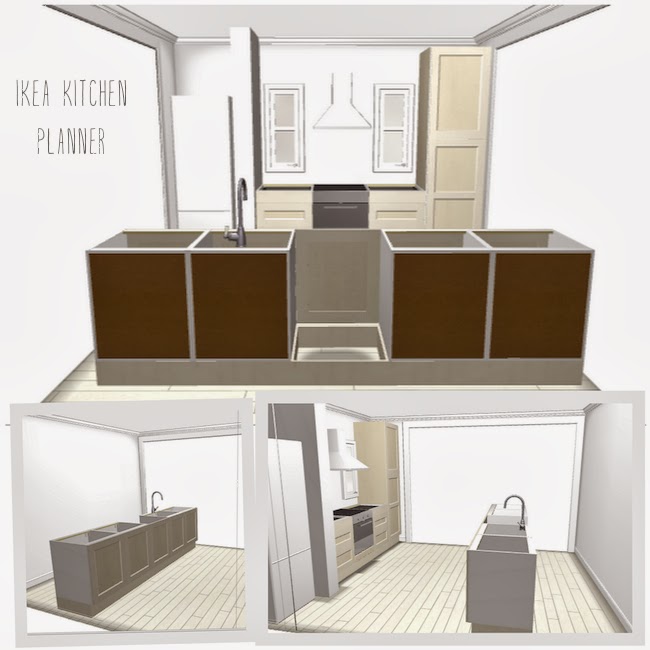
So what's the layout like? Oh glad you asked - I have this handy screencap of my Ikea planner that I somehow managed to do in the early hours of the morning I went down to Sydney and bought it all. Have I mentioned I'm a last-minute kind of girl? I've had this design pretty much from the start - we were ripping through the whole house so you could see from front to back - the kitchen was staying in the middle and so a large island bench was a must - it'd also create two thoroughfares through the kitchen area. I would have loved to have nothing on the island, but the length of the wall between the two walls that were removed wouldn't allow it AND a cooktop. So the sink is in the island - luckily, it's big enough to handle a sink and doesn't cramp its style too much. So without further ado...


 It's actually not that big a kitchen. Take away the sink, oven and dishwasher and I have a pantry, two sets of drawers, two full cabinets and one half a cabinet as the microwave is going on the top shelf (inside the cupboard behind the door, not built into the kitchen. I don't like microwaves on display). There are no wall cabinets or shelves going along that wall as the rangehood will be flanked by two windows. So that's it! Finger's crossed everything fits ok - I'm planning to spend the rest of today putting things away.

To add a tiny bit of extra space and to fill the gap above the fridge, we're planning to find some nice chunky rustic timber and put up a floating shelf above the fridge. I also think while black, white and grey is tops, there needs to be some warmth and natural elements in the space, so I am very inspired by these images below. I'd love some timber stools for the benchtop (at this very moment, I'm sitting on Imogen's Stokke highchair at the island - the only chair in our house high enough!) and maybe some timber shadow boxes on the small jut-out wall near the fridge for spices or pretty bowls. I'm also totally in love with the JUICE letters below and want to attempt to make some letter shelves for the kids rooms. If all else fails with the barstool search, I'll likely grab some replica Tolix stools in the aluminium colour - I spotted some at Mitre 10 for $35!


So we are slowly getting there - it's nice to not have to use an old cupboard door as my benchtop anymore! And if the plumber turns up like he said he would today, we should have a tap and useable sink by this afternoon - hooray! My poor bathroom sink will be happy about that!

Collages by me, last collage made from images via Goop (top), Doug & Elissa (right) and unknown (bottom).
The bathroom renovation part 1: moodboard, plans and before pics


The bathroom renovation has begun - yay! Its guts were ripped out on Thursday, frames were built and electrical work done on Monday, the plumbing "roughed in" (see? I know tech speak now) and walls put up on Tuesday. And today, the plasterer is sealing the walls and waterproofing begins tomorrow. Possibly - up until yesterday afternoon we had no tiler! Ahh the fun and games of renovating. We've been using the bathroom in our cabin, which aside from flooding during heavy rain, has been incredibly useful during this period - no cold hose showers in the backyard thank goodness. However, the hot water system in there is on its last legs so to stop it overworking AND overcompensating for is hopelessness by using extra power, we've had to turn the water and power on an hour or so before we want to shower, which means family shower time in the evening - because no one is keen to get up an hour earlier than necessary to have it warm for a morning wash. We grab our PJs and towels head into the backyard cabin for our shower. It's a little like camping, though I just imagine we live in a mansion and I need to walk to the other wing as my ensuite is being upgraded. Or something.... Funnily enough, the shower in that bathroom - teeny tiny space-wise - has the best showerhead and pressure. Hopefully our new rain-style showerhead will top that one! 

So up until last week, our bathroom looked like this:
 Just 175cm by 290(ish) - very small. It just fit a shower, bath and vanity. The toilet is in the laundry off the kitchen and seeing as we will be ripping that whole area out soon, we need to add a loo to our bathroom before that happens! There was a small pantry set into the bathroom (the door opened into the kitchen) which I decide would be better served as tall narrow built-in shelving in the bathroom. Because honestly, what a stupid sized pantry this is - it's about 15cm deep! 

While it's certainly not the worst bathroom I've ever had the pleasure of living with (this one was worse), it was still gross - the tiles were falling off in the shower, the water and vanity rotting, the bath was a big stain fest and there were mismatched tiles and mould everywhere. We wanted to make it look nicer and function better. To give you an idea of changes to the space, here is an incredibly professional-looking (!) floorplan of the before and after.
 
Unfortunately, there is no room for a luxe walk-in shower and freestanding bath in this house. Instead, we've rejigged the layout to make a shower and bath combo and leave room for a toilet and some open shelves. The vanity will be on the wall with an above-counter sink and the shower screen will swivel like our last one for easier access to the bath when washing little people. Instead of a towel rail, I've gone for hooks - this way we can actually have more hanging space for the SIX people who will be using it, unlike towel rails which require towels to be spread out and therefore less of them. Three to four will be on the wall and the others on the back of the door. The only thing that is staying is the door and the window - we were planning on replacing the window but it was an unecessary expense really - there is nothing wrong with this one (aside from its boringness) so to dress it up a little, we're tiling around into it so it'll be like a windowed alcove/shelf, which also addresses any fears I had with the window being SO close to the water.

So how will it look? We-ll, probably very white. We've got some dark grey floor tiles, white subway for the walls and a white vanity, benchtop and basin. I'm a little worried it'll look too white and slick, so I plan to frame the mirror with some timber and whitewash it similar to our floors. Hopefully a bit of timber will add some warmth and texture. Am also hoping the open shelves (floor to ceiling) will add some texture as they'll be stacked with rolled-up towels and some baskets of toiletries. Just need to find the right baskets!

I learnt a few lessons from our last bathroom reno and the previous ones I've lived with while renting.
- Pointy taps suck and can hurt your hands.
- Kids are great at dropping things that break into the sink by bumping it while on the vanity (and our vanity is never clear of stuff) so a raised basin not only looks nice, is handy too as nothing can fall in accidentally (on purpose is a whole other story though).
- Little gaps between fittings and walls are impossible to clean - hopefully a wall-mounted vanity will help this.
- White tiles on the floor just don't work as there is no win with the grout - if you use dark grout it looks like white grout that is dirty. If you use white grout, it always looks like dirty white grout!

So taking those things into account, here are some of our fittings this time around...


1. Mondella Resonance Chrome bath set, $75, Bunnings I admit I totally had these taps picked out before anything else in my bathroom. I just like the way that kind of stand out on the wall! But my dilemma was that all the vanities I looked at had one holes - for a mixer. I didn't want a mixer tap in the shower/bath because the kids can bump them easily and are more inclined to play with it because it's easy (my kids bump a lot). But I didn't want two different styles in the bathroom either. So I finally decided to mount the taps on the wall over an above-sink basin.

2. BTH Noah Wall WF-900 vanity, $620, Eagles Plumbing I looked everywhere for a vanity I liked - online, in stores, in showrooms... Eventually I found it and we had a few options - finger pulls or handles. I let Steve chose (because I honestly couldn't. And also, I need to let him have SOME say) and he chose the finger pulls. It looks a little like this but we have a basin that sits on top and the drawers are on the left. The basin will sit to the right so it's not so close to the door and gives us a little more benchspace. I also liked the fact the price included the vanity, benchtop AND basin.

3. Quantum Quartz benchtop in Alpine White (part of vanity price, above) Simple and white - I thought about something with grey flecks but the samples were so small and I just wanted to order it so it would arrive on time, so white it was.

4. Bellazza floor tile in Mystic Granite, $10.45 for a box of 11, Bunnings I used the same tile in a slightly darker colour for the floor of our laundry in our last house. I wanted something that would match the rest of the tones throughout the house and grey was it. It also looks good next to the whitewash of the floor (see first pic in post) and should provide a nice contrast to the all-white. When shopping for floor tiles take a bottle of water with you (or take a tile to a bathroom in store like I did) and splash some water on it and see just how slippery it is. Most tiles are going to be slightly slippery, but there is wet-bathroom-floor slippery and there is banana-peel-in-cartoons-slippery which is what you definitely don't want. The house we rented last had WALL TILES on the floor and was in the latter category. Lost count of the times one of my family members hit the deck at that house...

5. Siato above-counter basin (part of vanity price, above) I debated: round bowl vs square bowl. This rectangle one with rounded edges ended up being the best of both worlds! It's quite shallow but is large and pretty. The first one arrived on a courier in a box that looked like elephants had played soccer with it. Not surprisingly, the basin was all cracked. Next day it was replaced, no problems and I bought a pop-up plug to go with it. I'm usually don't give too much attention to things like plugs, but this is cool. For a plug. And can't get lost - bonus points.

6. Caroma Cosmo Chrome toilet roll holder, $25, Bunnings Recently Steve and I went away for a few days to celebrate our 10th wedding anniversary (10 years! high five!) - one of the places we stayed at had a toilet roll holder that was vertical. This - and the rain showerhead - was the highlight of the trip. Not quite, but it became a requirement that when I was shopping for bathroom items, could I please find a vertical toilet roll holder. So I found this one - with a similar round shape to the taps - that can be installed so it stands upright and the toilet paper roll WON'T FALL OFF! It will also mean it is harder for a certain little two-year-old girl to not unroll an entire roll of toilet paper onto the floor. Hopefully.

7. Johnson Waringa White subway tile, 58c each, Bunnings I think since I installed subway tile in our last kitchen, I was always going to use subway tile in our next bathroom. And that's what I've got! The tile will go to the ceiling in the bath area and around the window and small shelf alcove. There is also a little lip around the bath that will be tiled and then the rest of the room will have it as high as the vanity taps. This was a cost thing more than anything, but I think it will work well with the mirror and towel hooks sitting on the wall, not tiles.

8. Estilo Round shower head, $29, Bunnings The showerhead I really wanted didn't have any rubber bits on the holes and was about 50 times more expensive. We'll save that one for our ensuite. This should do the trick here - it's nice and big and will be installed slightly higher than normal as Steve is 6ft3.

So that's where we're at. It's all coming together and should be ready in a week or so! YIPPEEE!

{Images and incredibly awesome floorplans by Belinda Graham for The Happy Home; product images in the collage linked to in their description}


master bedroom moodboard

We are SLOWLY making progress in the bedroom. It hasn't been quite as fast as I though it'd be, but between being sick for going on FIVE WEEKS and being pregnant (12 weeks!), I'm not nearly as energetic as I'd like to be. That said, I've quite enjoyed the process. The bedroom was kind of a trial and error room. I wanted light Scandinavian-style floors - sort of whitewashed. I researched and researched and researched various ways to get the look and will do a whole post on it soon because it's not the norm. Which is another reason why it's taken so long! It's bit of an experimental room, really - the sanding, the sequence, the floor... hopefully it all turns out ok!

Just for fun, I thought I'd show you where I'm headed with this moodboard - I am kind of imagining this house to eventually be rather modern on the outside - so far our very, very rough sketches and builder ideas are more modern than I thought I'd ever have, but I'm starting to like the idea. On the inside, I just keep repeating these words: cosy, Scandinavian, Moroccan, mid-century, boho, beachy. If some of them sound wrong together, just know that I mean I'll take certain aspects of each "style" (a feeling, a shape, a motif, a palette) and make sure they all mix together well. I think all of these things will work in the bedroom - let's see, so far, we have...

1. Linen bedhead We will eventually get a new bed (we're keen a on a king size - lots of little people occasionally share our bed and it's getting cramped!) and I'd like to try making my own headboard. Problem is, I'm kind of stuck on what style I want. I really this one (Deborah Needleman's bedroom), but think it might be a bit too decorative/romantic for the rest of the space. Maybe just a rectangular shaped headboard with a nice pattern in the nailheads... The bed won't happen right away, so I've got time to work that out! Image via nymag.com

2. Aina curtains in grey, $79, Ikea. I had these in the natural colour in my old home in the bedroom and living room - they're a beautiful linen and let just the right amount of light through. This time, I'm going with the grey. I'm also thinking the same fabric would make the nice bedhead whenever that time comes!

3. Ticking fabric - somewhere whether it's pillowslips or cushions. I adore the simplicity of ticking fabric so it's a must.

4. Jezebel Small Capiz Shell Pendant Light, $34, Lighting Illusions I bought this light a few weeks ago - just waiting for the electrician to come (oh I suppose that is up to us to actually call him, right?!) and install for us! The tinkling will likely drive us batty if there is a breeze, but I love these shells and think it'll look lovely hanging in the centre of the room. Better than the ugly round batten fitting we have now.

5. Arlec Pharmacy Desk Lamp, $42.90, Bunnings I swear the price of this has gone up since last week, but anyway! Steve doesn't particularly want a lamp next to his bed, but he'll be getting one anyway. And I'll be attacking it with gold spraypaint.

6. Create 1 Light Pendant in White, $31.95 (on special), Beacon Lighting I grabbed one of these and spraypainted the top and bottom part gold (of course I did). I used Rust-Oleum Bright Coat in Gold and it worked a treat. This will hang over my bedside table (yet to be decided!) with....

7. Eric Therner Diamond Light, $45, Fat Shack Vintage Unfortunately it looks like they don't have them anymore, but this is where mine is from. I forced my sister to buy it for me for my birthday (not quite - we just tell each other what we want each year!). I love it - and you can really see its distinct shape against a dark backdrop.

8. Whitewashed floorboards. I'll write a whole post on what we did for ours, but they kind of look a little bit like this (maybe not quite so white...)

9. Horizontal tongue and groove paneling I'm excited about this - just revving ourselves up to do it! This will hide the remnants of the old wallpaper I stupidly decided to remove. Old painted-over wallpaper, super-duper glue and absolutely no patience do not a good combination make. For the sake of future owner's sanity, never put up wallpaper and then paint over it. Anyway. I had decided I wanted panelling somewhere and when the wallpaper removal process took longer than it should, I decided that wall was perfect for it. And it will be - our bed will be up against that wall and it will look so purdy all nice and charcoal. It will hopefully look a little something like this - colour and all. Image via Real Living magazine

10. Moroccan Trellis Shag Rug, Overstock.com I love this rug as I may have mentioned last post. Still working on the hubby's approval :)

11. Paint colours We went with Dulux Lexicon in quarter strength for the walls, ceilings (low-sheen) and trim (semi-gloss). I like my whites to be very white so this was the closest to untinted that you can get! I also prefer to have either huge contrast in trims (ie, a dark wall and white trim) or no contrast - I don't like two different shades of white so close to each other. To me it just always makes one of them look dirty! The feature wall paneling will probably be British Paints Rhino Grey. The lamps will be spraypainted in Rust-Oleum Bright Coat Gold.

12. Parker sideboard Have I mentioned this sideboard before? I found this exact same Parker sideboard on the side of the road. Yes, for free. And better still, the man who had put it on the clean-up pile happily delivered it to me as I couldn't carry it by myself (he only lived 100 metres down the road). How nice is that? It's in great condition and is huge - aroubd 230cm long! I did a little research and I've seen the same one sell for $2000. So not a bad find, I'd say! This will house most of my clothes for now until we can turn the bedroom next to us into a walk-in and ensuite. Image via julietsbalcony.com.au

So there we go! Still need to work out side tables - I might use my tree stump again or scour some local charity stores and council clean-up piles for something I can save and fix up. I'm sure I'll find something eventually! Hopefully I'll be able to show you this moodboard translated into an actual room soon enough! Stay tuned! x
how did i not know this? overstock.com ships to australia!


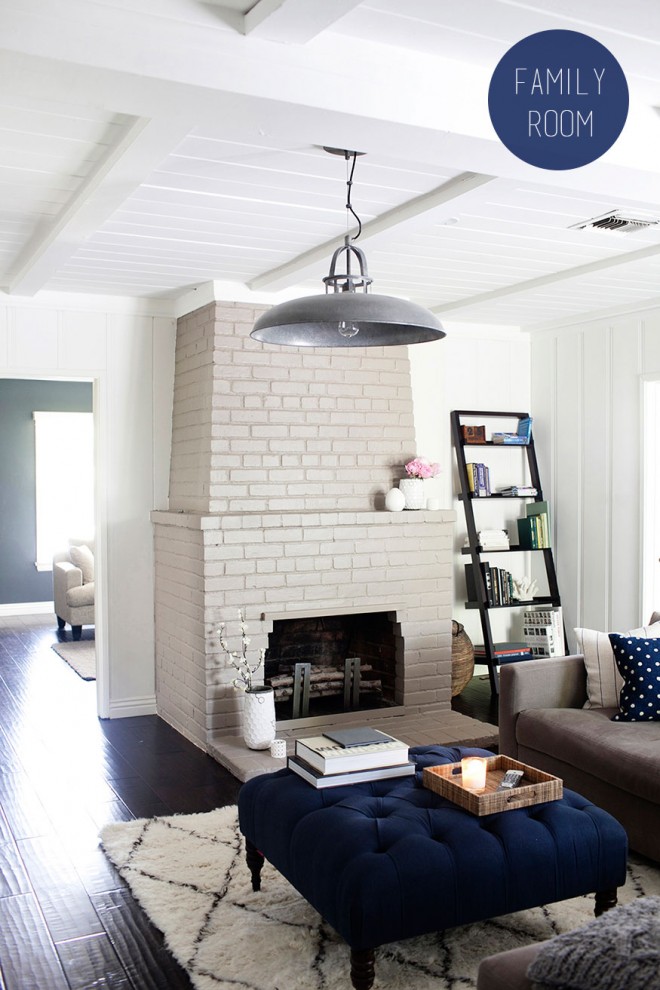
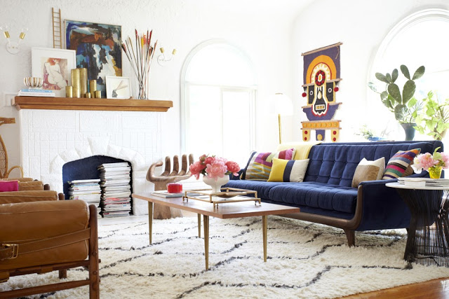
Seriously, I thought I was kind of in the know about these kinds of things, but clearly I am not. I guess my ability to know helpful things ahead of the pack vanished with my organisational skills, patience and "me time". Anyway, while ignoring my half-painted bedroom the other day and instead looking at the #livedinerest hashtag (a Country Road and Great Dane Furniture competition), I stumbled upon a lovely faux Moroccan Beni Ourain rug in someone's living room that looked just like the Rugs USA one, above in Bri Emery's living room, and below, in Jen Pinkston's family room. 

Rugs USA don't ship to Australia - I know this because I've checked several times in the past year or so because I was very keen on that particular rug. Instead I had my heart set on the West Elm Souk Wool Rug with the tassles (below, in Emily Henderson's living room) until Steve vetoed it with a rather impressive list of things he didn't like about it - most of which involved the fact he thought it looked like a child had scribbled on it. Oh. How DARE husbands have a say in these things....

Anyway, in my earnest attempts at winning him over with Pinterest searches of real Beni Ourain rugs and "this is the look I'm going for"statements, he pointed to one of them in the classic diamond shape (below, via Danielle Oakey Interiors - I am assuming that is the real deal) and said he didn't mind that. "Don't mind it" can be kind of twisted into "I love it just as much as you, babe". So I will take that and run with it - back to my original rug plan. And back to my hastag procrastination - I asked the instagrammer where she bought her rug and she answered Overstock.com. At first I assumed she was in the states, but then I realised not so - she was Australian too and so unless she'd smuggled it back in a suitcase on a recent trip, then Overstock shipped to Australia. A few clicks later and I discovered that not only did they ship here, the shipping is VERY nicely priced. Twenty-five-ish bucks for a rug to be delivered to my door in a week from another country? Nice. (Slight side note: the cost of mail in this country is appalling. I once sent 4 magazines overseas. It cost me $40 in postage. And I hate websites with a flat-rate of $12.95 and all you want to buy is a giant balloon that would fit in an envelope.)


So anyhoo, many hours later browsing the site and ooohing at all the cool patterned rugs I now have access to, I still kept going back to that diamond shape one, aka Handmade Moroccan Trellis Wool Shag Rug. And I wish this story had a happy ending, but it doesn't (yet). I've been told I'm not allowed to get pretty things yet until we have actually done some hard work. Gah. How dare he be so sensible sometimes... So, in my twisted little mind I've devised a plan - I want that rug in my living room. BUT. The bedroom is actually going somewhere soooo, if when the bedroom is complete I can say "ta-da! It's finished but we just need a rug in here" and BOOM. Hopefully it'll be sold. To me. And not sold out, which it may well be after I share this (most likely old) news on here, now. I'm trusting you all to leave me one though ok? And then, you know, there is nothing stopping me from maybe rearranging rooms here and there in the near future, right?! 


In the interest of those who are also out of the loop, here are some funky, affordable rug options for you. That overdyed turquoise one is coming a close second to my beni-alike. And don't think Overstock.com is just about rugs. Oh no. That is all I was really obsessed with at the time as I find affordable rugs hard to find here. And I certainly couldn't bring myself to put something worth thousands of dollars on the ground for my (almost four!!!!!!) children to go trampling all over. I can't do precious in this house. So I haven't had even had a chance to have a proper look through the site yet (though I am assuming there are going to be big bulky items that won't be able to be shipped internationally), but I do know you can get pretty much anything on there - furniture, homewares, electrical (not really recommended for international buyers as we have different plugs), clothing, health and beauty, jewellery... There is also a handmade section called Worldstock Fair Trade selling beautiful items and benefitting various artisans from around the world. So if shopping for the pretty things isn't incentive to get working harder and faster, then I don't know what is :)

Did you know Overstock shipped to Australia? Have you bought from them before? What do you think of the selection above - anything tickle your fancy?